
In the current data-driven era, proper interpretation of data and quick analysis has become an imperative for making correct decisions. Visualization of data becomes very crucial for simplifying large datasets and rendering actionable insights. This blog will elaborate on best practices in data visualization especially when one makes use of applications like Analytify, how it could easily enhance one’s decision-making process.
What is Data Visualization?
Data visualization is the graphical or pictorial representation of data that allows decision-makers to see analytics in visual format. This allows for the quick identification of patterns, trends, and outliers thereby aiding decision-making.
Why Use Analytify?
Analytify is a great application that works very well with databases and many more, making it easy for the users to represent their data visually. It streamlines the process of reporting and gives insightful, easy-to-understand dashboards to cater to a wide range of stakeholders.
Best Practices in Data Visualization
- Know Your Audience
Before creating a visualization, it is important to know who will be using it. Different stakeholders may require different insights. For instance, high-level executives might need an overview, while data analysts may require detailed metrics. Tailoring your visuals to your audience ensures that the data communicates effectively.
- Choose the Right Type of Visualization
The choice of visual type can, in fact, influence the interpretation of your data heavily. Here is a list of several common types with when to use each:
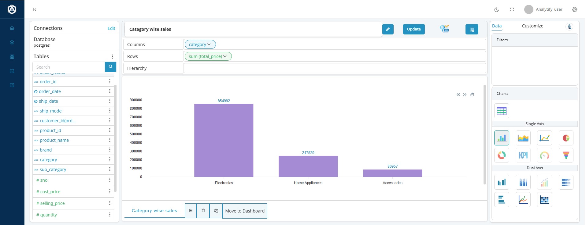
Bar Chart: Useful in comparing quantities among different categories
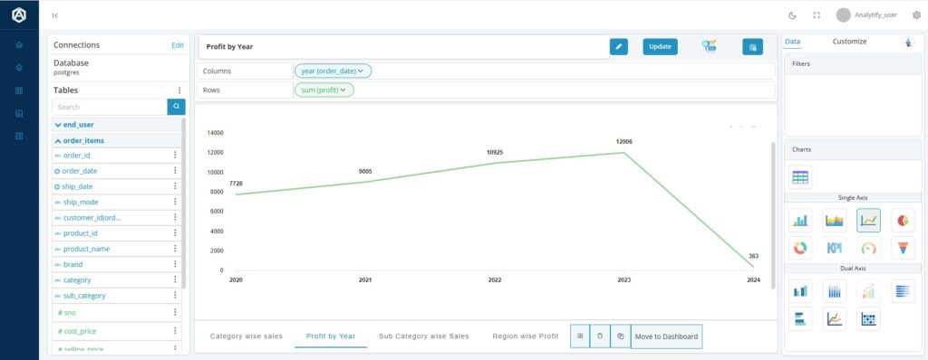
Line Chart: Best for visualizing trends along time
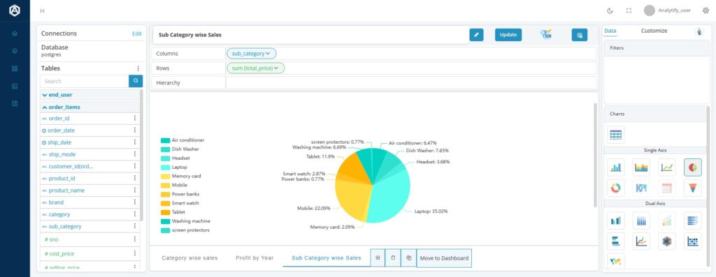
Pie Chart: Helps in showing what percentage of the whole is made of each category and should be sparingly used, as it cannot be read so well with too many categories.
Heat Maps: Effective for displaying data density or performance across various criteria.
Analytify helps you to select the most appropriate visualization types based on the data you are working with.
- Keep it Simple
Data visualization should be simple. Avoid clutter by limiting the number of elements in your charts. Use white space effectively and focus on the key data points that support your narrative. Too much information can overwhelm the viewer and obscure the message.
- Choose the Right Colors
Color plays an important role in data visualization. Apply color to indicate significant data points or trends but be careful not to overwhelm the audience with too many colors. Keep to a limited color palette that is relevant to your brand or message you are trying to communicate.
- Contextualize with Comparisons
Comparative graphics might help in finding valuable insights. For example, current data vs. historical performance will help bring context to the results. Through Analytify, you would be able to generate comparative reports that can further assist you in illustrating trends for stakeholders who may not readily understand the implication.
- Accessibility
Consider accessibility in building your visualizations. Use color contrast in charts for use by those with visual impairments. Make text readable across devices by not being too small. Analytify’s responsive design supports multiple screen sizes to make accessibility rich for all.
- Make it Interactive
Interactive dashboards allow users to interact and explore data dynamically. Features like filtering, zooming, and tooltips can add value to user experience as they help the stakeholders dig deeper into data of concern. Analytify offers interactive features that empower users to intuitively explore the data.
- Tell a Story
Every visualization should tell a story. Determine what narrative you want to deliver with your data. A logical flow in the way you communicate information can walk your audience through insights and conclusions, making it easier to make informed decisions.
- Always Improve and Iterate
Finally, data visualization is not a one-time effort. Regularly review your visualizations and gather feedback from your audience. Analyzing how stakeholders interact with your visualizations can provide insights into areas for improvement, which can be particularly insightful when using the comprehensive analytics offered by Analytify.
Conclusion
Data visualization is one of the strongest tools that enable effective decision-making. Leverage Analytify to build insightful, clear, and presentable reports and hence enhance the analytical capabilities of your organization. Be sure to keep in mind your audience; choose the appropriate types of visualization, remain simple, and then iterate through processes. With such best practices, transform your data into actionable insights driving smarter decisions.
Ready to Take Your Decision-Making Process to the Next Level?
Elevate your data visualization game with Analytify. Today, discover the ways to make your data visually appealing, to streamline reports and drive impactful decisions.
See Analytify embedded inside a live SaaS product.
Get a 30-minute walkthrough. Open-source, multi-tenant, enterprise-ready.